

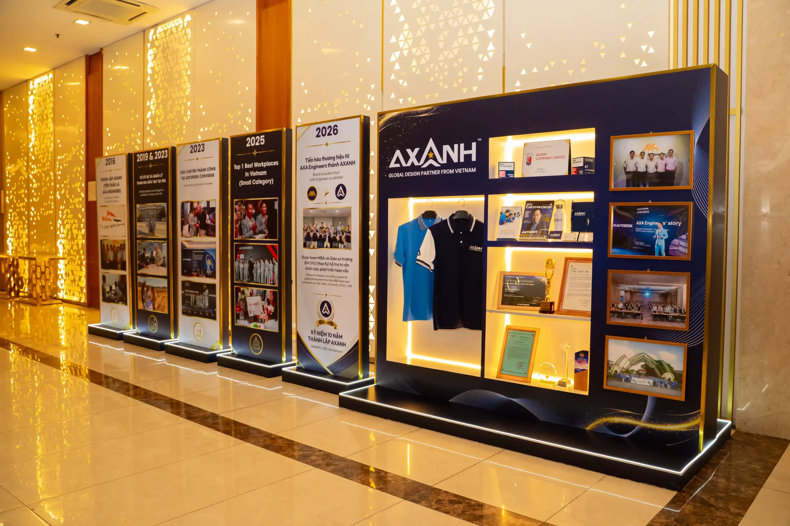





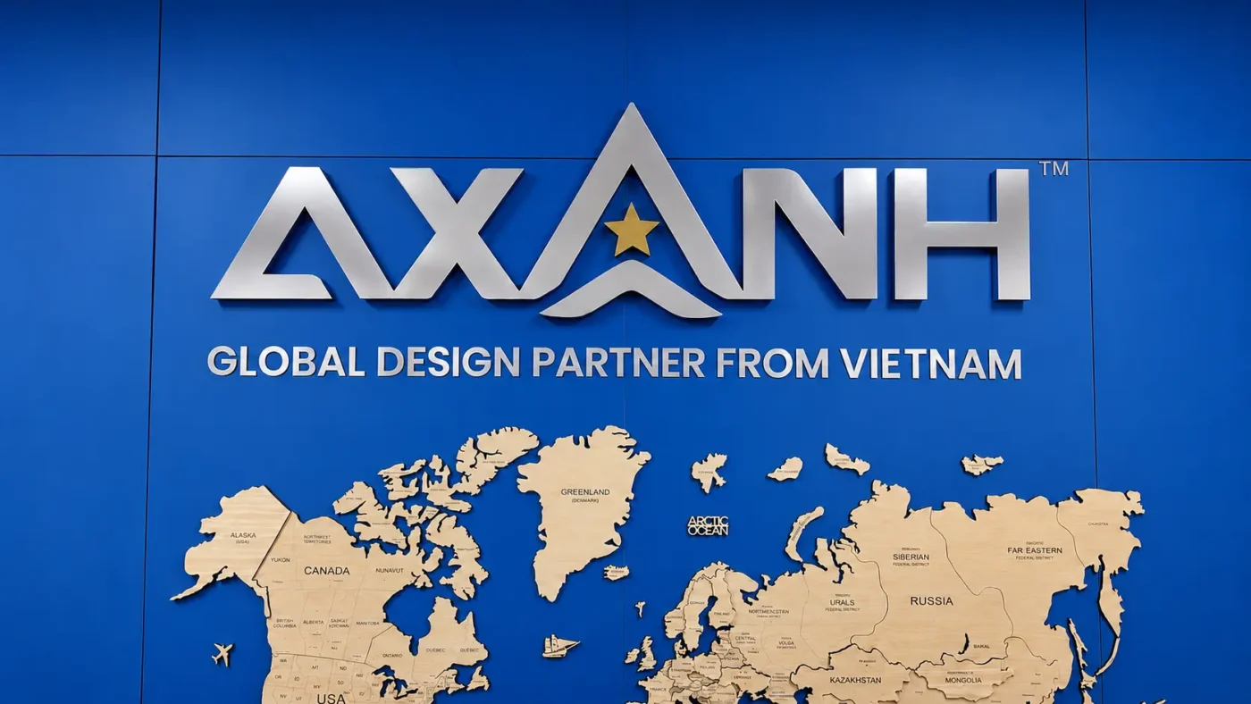
AXANH logo meaning begins with a simple idea: a corporate identity should express not only who an organization is today, but also what it intends to protect, improve and become in the future.
Built on a decade of capability development through AXA Engineers, AXANH represents the next chapter of a corporate brand growing with greater clarity, stronger systems and a wider global outlook. The identity was introduced as part of the AXANH Evolution Day, marking a transition toward a more mature expression of who we are and what we aspire to become.
The AXANH logo is therefore more than a graphic mark. It is a visual manifesto connecting engineering discipline, upward ambition, humility, human responsibility and pride in our Vietnamese roots.
AXANH Logo Meaning: A Visual Identity for the Next Decade
A growing organization eventually reaches a point when its identity must communicate more than its history. It must also express its direction.
The AXANH identity was developed to carry both dimensions. It preserves the technical foundation and trust built over the previous decade while creating a clearer visual language for the future—a future shaped by international professionalism, sustainable growth and the continued development of Vietnamese engineering talent.
The meaning of the identity is expressed through several connected elements: the geometry of the wordmark, the central A, the upward movement, the higher peak, the gold star, the hidden heart and the balance between navy and gold.
These elements should not be read as isolated decorations. Together, they form a coherent visual system that connects technical discipline with organizational purpose.
In the wider context of brand identity, logos and symbols can function as distinctive signs that help people recognize and differentiate an organization. The World Intellectual Property Organization’s trademark overview provides additional context on how words, symbols, drawings and color elements can support distinctiveness.
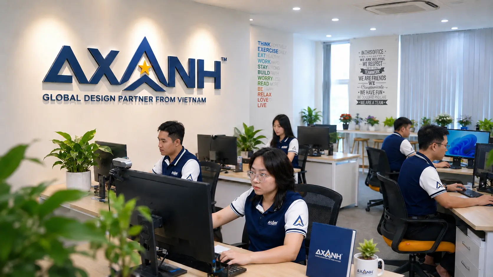
Seen within a workplace setting, the identity begins to move beyond a graphic system and becomes part of the environment where people focus, collaborate and make decisions.
The AXANH Wordmark: Engineering Logic and Collective Momentum
The AXANH wordmark uses a bold geometric structure with balanced proportions and clear lines. This construction is intended to reflect qualities expected from an engineering organization: precision, discipline, stability and systematic thinking.
The substantial letterforms create a sense of reliability. They communicate a foundation designed to endure rather than an identity shaped around short-term visual trends.
Each line appears deliberate. The geometry is controlled, the proportions are balanced and the overall form remains easy to recognize. This visual discipline reflects an organization that values standards, coordination and clarity.
At the same time, the extended and connected rhythm of the wordmark suggests forward movement. AXANH is not represented as a collection of isolated individuals, but as a team moving toward a shared direction with purpose and continuity.
The wordmark therefore brings two ideas together: the stability of a strong technical foundation and the momentum of an organization continuing to develop.
The Central A: Ambition Shaped by Humility
The central A is the visual and philosophical core of the AXANH logo. Its structure brings together two ideas that must remain in balance: the ambition to progress and the humility to keep learning.
An Upward Arrow Powered from Within
The lower section of the A resembles an upward arrow. It represents sustainable growth driven by internal capability—not by appearance, shortcuts or temporary momentum.
For AXANH, progress is built through daily improvement, stronger systems, deeper expertise and the collective effort of people who are willing to raise their own standards.
The upward form also expresses initiative. It suggests that meaningful development begins with the decisions, habits and efforts made inside the organization before the results become visible to the outside world.
A Higher Peak Beyond Every Achievement
The upper structure of the A opens toward another height. It evokes a simple principle: beyond every mountain, there is another mountain.
This is a reminder that achievement should not become complacency. Every milestone creates a responsibility to remain grounded, continue learning and prepare for the next challenge.
The higher peak also protects the identity from becoming an expression of self-congratulation. Instead, it makes the symbol a reminder that every achievement belongs to a longer journey.
Ambition gives AXANH direction. Humility helps the organization remain capable of reaching the next level.
The visual structure below brings these ideas together: upward movement begins from within, while the open peak keeps the symbol oriented toward what comes next.

The Gold Star: Excellence, Responsibility and Vietnamese Roots
The gold star sits at the center of the A. It is not a separate decoration; it is the heart of the visual system and one of the most important elements in understanding the AXANH identity.
A Symbol of Excellence
At its first level, the star represents excellence and the continuous pursuit of higher standards.
Excellence here should not be understood as a claim of perfection. It represents the discipline to improve, the courage to review weaknesses and the willingness to continue raising the quality of work.
This distinction matters because a meaningful symbol should establish a direction rather than make an unsupported claim. The star represents the standard AXANH intends to pursue through its systems, people and daily decisions.
Five Circles of Responsibility
The five points of the star express five connected circles of responsibility that AXANH seeks to keep in view as it grows:
- Clients: creating dependable and sustainable value through the work we undertake.
- People: supporting the development, well-being and happiness of those who build AXANH every day.
- Partners: building trust through transparent, responsible and mutually valuable collaboration.
- Community: contributing thoughtfully to the people, institutions and professional ecosystems around us.
- Nature: considering environmental responsibility as part of long-term technical and organizational decisions.
These five areas are connected. Long-term value for clients cannot be separated from the development of people, the quality of partnerships, responsibility toward communities or respect for the natural environment.
As AXANH grows, the five points provide a visual reminder that organizational progress should create value across more than one dimension.
A Vietnamese Star on a Global Journey
The gold star also reflects AXANH’s Vietnamese origin. It is a reminder that global ambition does not require an organization to leave its identity behind.
AXANH seeks to bring Vietnamese intelligence, dedication and professional capability to the world while remaining grounded in where we come from.
The Hidden Heart: High Performance with Kindness
One of the most distinctive details of the central symbol becomes visible when the A is viewed from another orientation: its form suggests a heart.
This hidden heart carries an important message. Technical excellence and high performance are necessary, but they should not be achieved by removing humanity from the way people work together.
The heart supports AXANH’s belief in High Performance Through Well-Being—an environment where demanding standards can coexist with respect, honesty, development and kindness.
This philosophy does not remove accountability or reduce expectations. Instead, it asks the organization to pursue strong performance through clear standards, responsible leadership, meaningful development and mutual respect.
Kindness in this context does not mean avoiding difficult conversations. It means approaching responsibilities, feedback and decisions with honesty and fairness while respecting the people involved.
The hidden heart reminds us that how we work matters as much as what we produce. Sustainable performance becomes more achievable when people can take responsibility, pursue excellence and still treat one another and their partners with genuine care.
Navy and Gold: Professional Confidence with Human Warmth
The AXANH color system brings together two complementary expressions. These colors are not merely aesthetic choices; they support the broader meaning of the identity by balancing technical confidence with warmth and aspiration.
Navy
Navy represents technical professionalism, stability and trust. Its depth reflects the seriousness, discipline and reliability required when operating in international engineering and design environments.
The color also creates visual consistency. It gives the identity a stable foundation that can work across corporate communications, technical documents, workplace applications and digital platforms.
Navy therefore acts as the structural color of the identity. It provides visual weight and gives the logo the sense of confidence expected from an organization with an engineering foundation.
Gold
Gold represents value, achievement and aspiration. It also introduces warmth into the identity, ensuring that professional confidence is not expressed as distance or rigidity.
Used as an accent rather than a dominant field, gold draws attention to the parts of the identity associated with purpose, direction and human value.
The gold star becomes a natural focal point because it is surrounded by the stability of navy. This contrast helps the central symbol remain clear without separating it from the wider wordmark.
Together, navy and gold create a balance between strength and humanity, international professionalism and Vietnamese character, established capability and future ambition.
The Starwave Motif: Extending the Identity
The Starwave Motif expands the visual language of AXANH beyond the primary logo. Its layered lines appear to radiate outward from a central star, expressing how value can begin at the core of an organization and extend toward clients, people, partners, communities and the wider environment.
The motif is best understood as a visual expression of movement from the center outward. The image below shows how the central star expands into a broader system of lines and rhythm.

The motif can support backgrounds, communication materials, presentations, proposals, workplace graphics and digital touchpoints. It gives designers a recognizable visual element that can be applied more flexibly than the primary logo.
However, the Starwave Motif does not replace the official logo.
The logo remains the primary identifier. The motif is a supporting visual language that helps the AXANH identity remain recognizable, flexible and coherent across different applications.
The relationship between the two elements is intentional: the central star represents the core, while the expanding waves represent the value and influence that can move outward from it.
From Logo to a Consistent Brand System
A strong identity becomes valuable when it is applied consistently. For AXANH, the logo and its supporting visual language are intended to create alignment across multiple touchpoints.
These applications may include:
- corporate websites and digital platforms;
- company profiles and strategic presentations;
- proposals and communication materials;
- technical documents and project-related materials;
- office signage and workplace environments;
- uniforms and internal brand applications;
- internal and external communication campaigns.
That consistency becomes more tangible when the identity moves from design files into the spaces people use every day. The meeting-room installation below shows the AXANH logo as part of a real working environment.
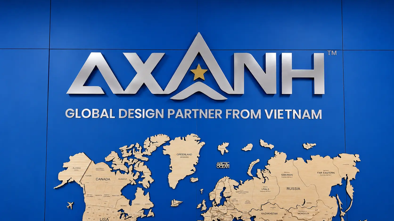
In this setting, the logo becomes more than a visual asset. It forms part of the environment where conversations, decisions and collaboration take place.
Consistency does not mean that every application must look identical. It means that the same visual principles, proportions, colors and hierarchy should remain recognizable wherever the identity appears.
The official logo should remain clear and protected. The Starwave Motif may add movement, depth and visual interest, but it should always support rather than compete with the primary mark.
Clear rules also help prevent the identity from becoming fragmented. Incorrect proportions, inconsistent colors or excessive decorative use can weaken recognition even when individual applications appear visually attractive.
A consistent brand system therefore depends not only on design assets, but also on the discipline with which those assets are applied.
More Than a Mark: A Standard to Live By
A meaningful logo cannot remain only a design explanation. Its real value depends on whether the organization is willing to live up to what it represents.
For AXANH, that means continuing to:
- raise the standard of quality and professionalism;
- develop capability through consistent internal effort;
- remain humble before every achievement;
- act with kindness, honesty and responsibility;
- grow through alignment and collective strength;
- create lasting value for clients, people, partners, communities and nature;
- bring Vietnamese capability to the world without losing its identity.
The logo therefore carries both aspiration and accountability. The upward arrow asks the organization to progress. The higher peak asks it to remain humble. The star provides direction. The hidden heart protects its humanity.
These ideas become meaningful only when they influence real behavior: how standards are maintained, how people are developed, how partnerships are approached and how decisions are made.
Ultimately, the AXANH logo is both an identity and a commitment: to grow through value, remain sustainable through kindness and reach farther through the strength developed from within.
Explore the Story and Direction of AXANH
Discover how our identity, operating philosophy and long-term vision shape the way we build capability and trusted collaboration from Vietnam.
